James' IDD 410

Thursday, December 14, 2006

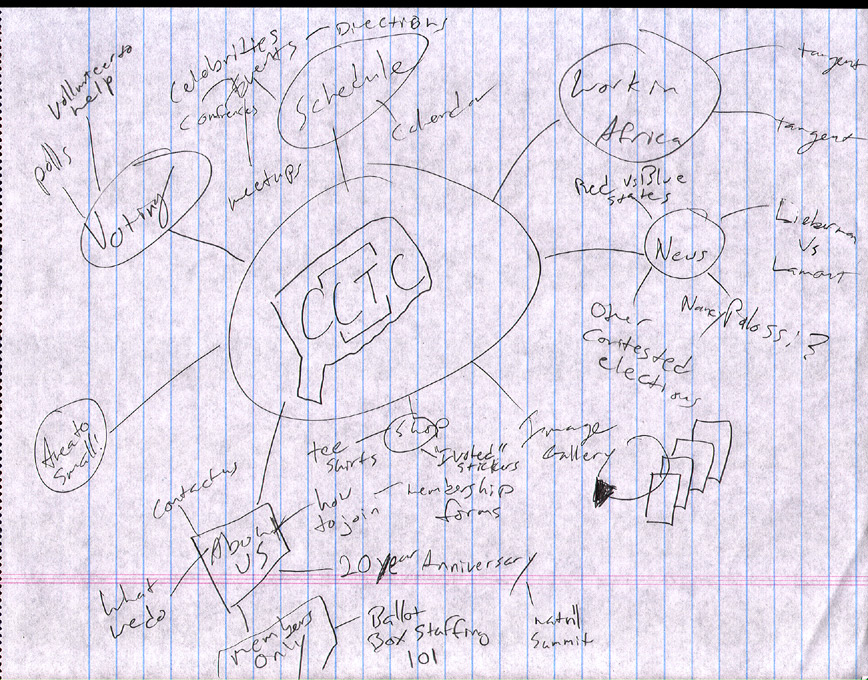
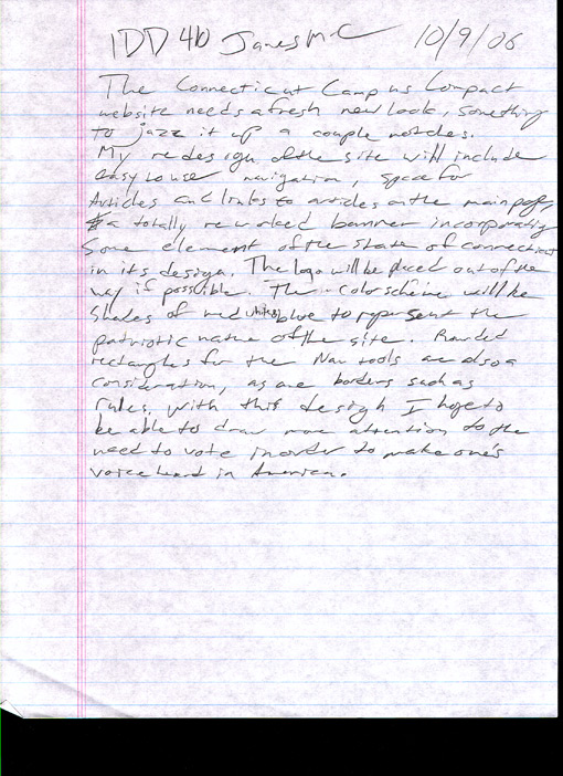
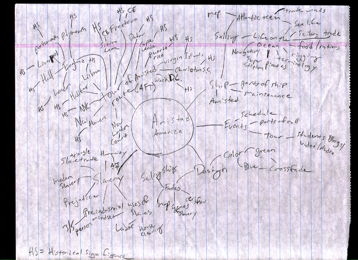
MP 18, MP 19, MP 24 scans from notebooks

I found the stuff for MP 18, 19, and 24, but not 22 like I had expected. I am including them as JPGs here in this post.


Chapter 4 - Site Seeing 5 golden rings point presentation

Visual organization is achieved on the web through coordination of color, shapes, and text based hierarchy, as well as simple, clear cut navigational tools.

Sound takes up a lot of bandwidth, and is hard to use on a 2D field, so almost all organizing on the web is done visually.

Giving the graphics of your webpage variable weight between them helps to create your page's organizational structure. Visual weight sets how much an object on the site will jump out at the users, or how much it WON'T as is the case with disclaimers and EULA's. You wouldn't want the user to know you were buying their soul from them by making it bright red and placing shimmering, in 72 point font.

Templates, or a basic design which stays the same from page to page, can help the user feel that the site is professional and well organized, as well as give the impression that all the pages are related, even in the case of wikipedia, where you could have a thousand different subjects all on pages that look nearly identical.

A planned hierachy can make or break your site. What is it that your want the user to see first? Is it the logo, or that moving gif of the mouse and his cheese in the bottom corner? Don't lead your audience astray by giving too much weight to the wrong thing.

Chapter 3 - Um... noticing a trend 5 points

The site must be able to be browsed quickly and efficiently. No hunting or searching all over the place. No one wants to spend an hour looking for a piece of information, and they probably won't return if they have to.

Maintain established web standards. If people expect a nav bar on top or on the left side, then by golly, you better give it to them! The vast majority of people HATE surprises.

When using External Links, try and make it so that your page stays in one browser window or tab, and the external link, opens, well... externally. That way the user is not whisked away from your site entirely.

I reiterate, don't dispose of the nav bar! It's what people want!

The site should run relatively quickly, even on older machines. CSS allows us to dispose of byte heavy graphics, and replace them with what is essentially a scalable block of color.

Chapter 2 - Better Late than Never 5 points

Make sure you have an awesome battle plan before going in and trying to tackle a site. Think things through, down to the smallest detail, such as "Where should I put the recipies pages? Should I link them by author, or category? Should measurements be in metric or standard (in the recipies AND on the site). What colors will show up on an RGB screen well with this shade of red?"

Organization is KEY. If you cant remember where you placed a link or a page, it's as good as lost to the end user.

The Nav bar should help your viewer know where in the site they are, which is why you often find secondary menues along the site, with a clearly labeled section marker.

Keep in mind that the vast majority of users are not using the best software or computers, so make it useable for lower end users. High enders might not OOOOH and AAAAH as much, but at least you wont lose a vast portion of your audience.

Keep in mind that there may be various other limitations with things like plugins. Does the user need a flash or java plugin to view the site properly? Then perhaps a splash page explaining that is necessary.

Thursday, December 07, 2006

woodhall mockup

Proposal for Major Project 3

The new headmaster from my high school asked me at the wedding of an alumnus, to help them out by donating my services and building them a new website. Nothing fancy, but it has to look professional, use the school colors, contain some photos, and make information relavent to prospective students and parents easily avaliable and accessable (no more than 2 links deep). They provided me with some copy and photographs (more to be recieved tomorrow at our meeting), and a schedule of events they wish to be posted on the site. Server side technologies can not be used, so this site must be done in basic HTML and CSS.

Thursday, October 19, 2006

something

something something

Thursday, October 05, 2006

Amistad

Amistad

Amistad

Thursday, September 28, 2006

Public Mission Statement

It is the purpose of this redesign (for quinnipiac branches) to provide greater ease of use to end users, provide clear visual idenity, and allow the ability to alter content through use of CSS/PHP scripting, rounded rectangular guiding shapes, and school colors (yellow and blue), while allowing the client to provide greater connectivity to the catholic community on campus.

Thursday, September 21, 2006

Mission Statement

It is the purpose of My Personal Website™ to open up economic possibilities for myself through professional promotion, using available internet technology and personally created media to reach the largest possible professional audience with whom to engage in dialouge and showcase my professional works and skills, in a cost effective, fun, and non-offensive manner.

2 new comps

QU Branches 1
QU Branches 2

5 points on chapter 1

Points made in “Site Seeing”
1. Know your intended message, and focus on it. There are many people in the world with many different ways of thinking about the same thing (god for example, like in our comps due today), and unintended ideas, some of which are possibly offensive, may arise from not thinking through an intended message properly.
2. Know your client. I know this better than most, as while at the company I’ve been working for, we have had “good clients” and “bad clients”. Good clients have a general idea of what they want, and are willing to communicate with you and negotiate about what can and can’t be done, whereas bad clients fight amongst themselves and end up rejecting everything you offer, even though some of the various elements may agree from time to time, all of them will never fully agree on anything. Avoid bad clients, no matter how desperate you are for business. Getting to know your client, and which type they are, can be crucial to your sanity, reputation, and your bottom line.
3. Collect as much important information as possible! If you miss something, you might screw everything up, and end up with something that you’ll be embarrassed to show the client. Like say, if you forget their logo, or forget that the purpose of the site is to sell things, and forget to provide any links to a store, and focus more on the technical side of things, you’ll have to go back and do everything all over again.
4. Know the audience. Do not place possibly offensive material on a site meant for the eyes of children. You will pay dearly for it! Also, how knowledgeable is your intended audience about the target product/service? In many cases people will browse the net to find out more, or for professional services, may know quite a bit already. Do not assume however, and make sure that additional information is available, even if it’s not on your site. Consumers want pictures of the products they are buying, and will often assume that what they see is what they are going to get. I bet Ikea has this problem all the time.
5. Mission statements are a useful tool in everyday life. You write them without even knowing in many situations, like a grocery list or appointment book. You intend to A. Pick up those products or B. Make sure you are at a certain place at a certain time. Make sure everyone at your firm is on the same page about what the message should be, or you’ll end up with a varied and wide ranging array of messages which may contradict and or vary from one another.

Thursday, September 14, 2006

Comps for 9/14/06 Leaf and Flame

Leaf Motif

Flaming Pentacle